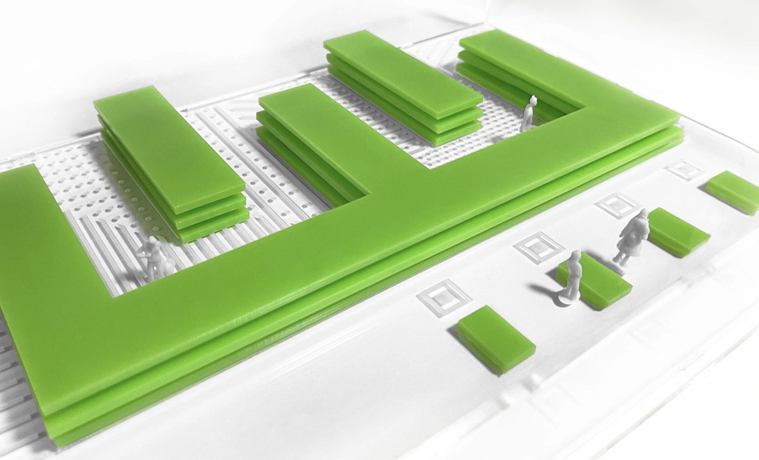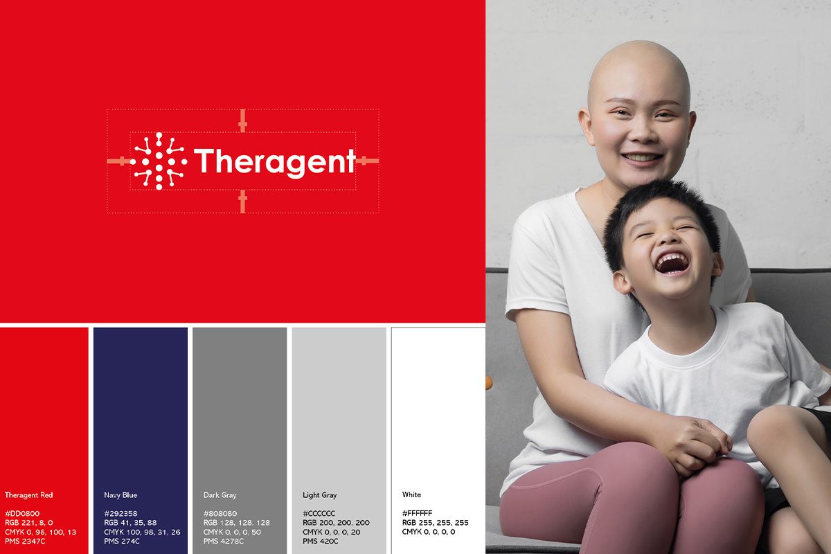
A new visual identity for Theragent, a cell and gene therapy manufacturer in Southern California. I took it from a single cell-inspired pattern to stationery, a reception installation, lab environments and app concepts.
Theragent is a full-service, cGMP-compliant cell and gene therapy CDMO: a contract development and manufacturing partner working with CAR-T, stem cells and NK cells. Its headline says it plainly: patients are waiting.
It needed a new visual identity for digital and print. The brand had to feel as precise as the science, without losing sight of the people the work is for.
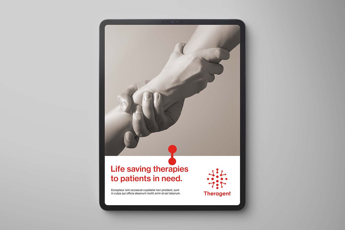
Rather than borrowing generic lab imagery, I built the identity from the science itself. A custom pattern based on how CAR-T cells connect became the brand's visual signature.
It's ownable, it tells the story at a glance, and it scales from a business card to a reception wall.
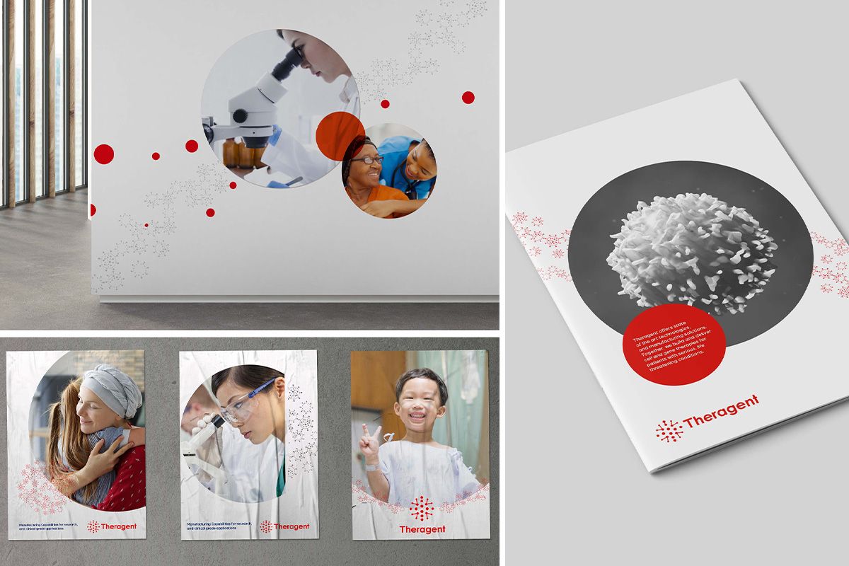
The identity runs through every touchpoint: business cards and a full stationery set, a bespoke reception installation, branded graphics for the lab and office spaces, and UI concepts for a mobile app.
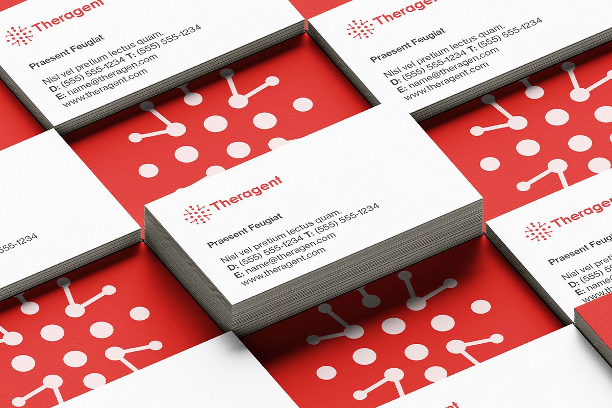
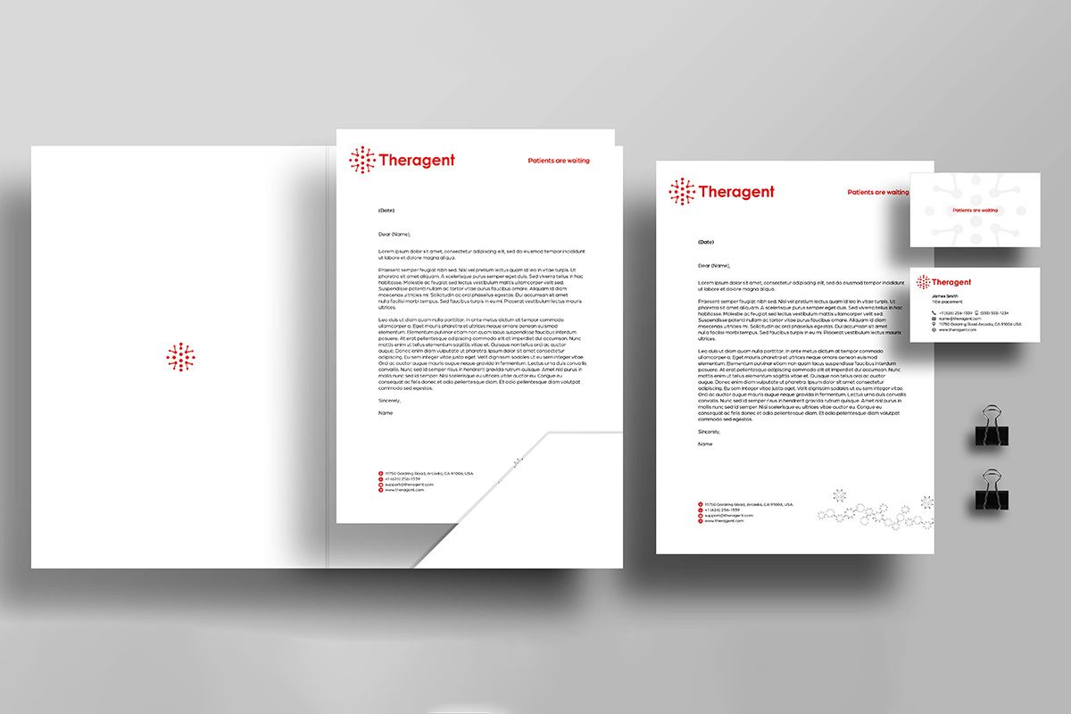
Business cards and stationery set
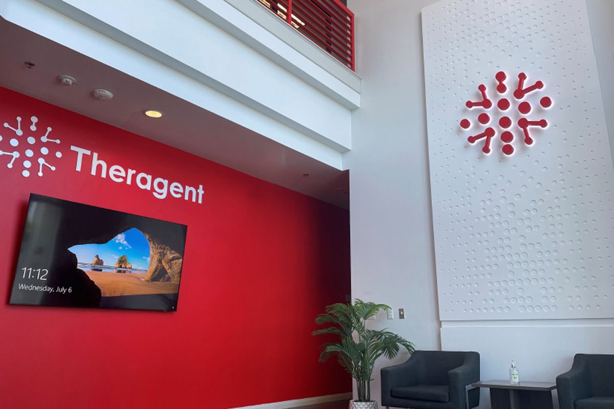
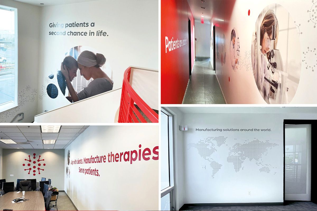
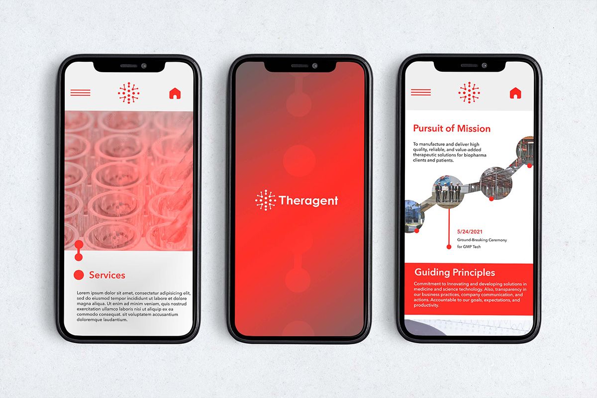
Lab and office graphics, and mobile UI concepts
Theragent now has one coherent identity across print, digital and physical space. Visitors, partners and staff experience the same story in the reception, along the lab corridor and on screen.
The pattern keeps the science at the heart of the brand, and the people at the centre of the story.
In life sciences, trust is designed. Every detail should feel as precise as the science behind it.
Next case study